Katie Kelly Pilates
(NE1 / NE2)
Behind the design: Katie Kelly Pilates
This project began with a deep dive into the world of Pilates — not just the movements, but the culture and energy around it. Through research and conversations, I kept circling back to the vibrancy of 1980s workout aesthetics. There was something refreshing about the unapologetic boldness of that era and it became a jumping-off point for a brand that feels lively, fun and full of character — without ever feeling gimmicky.

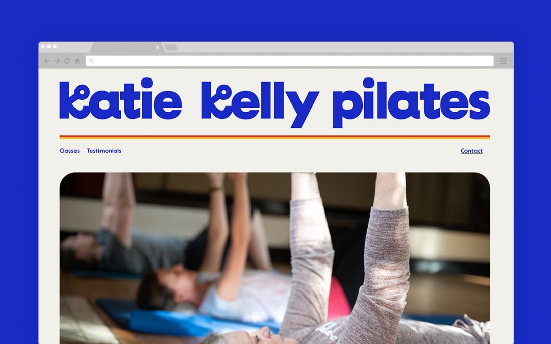
Katie wanted her brand to feel light, warm and approachable. I created a full brand identity — logo, icon, typography and a set of friendly illustrations inspired by the shapes the body makes during Pilates. At each stage we worked closely together to shape the direction, making sure it always felt true to her voice and values.

The website carries that same tone — engaging and playful, but still clear and considered. I used black and white photography inspired by early images of Joseph Pilates to ground the brand in its roots, contrasting nicely with the vibrant visual elements.

This was one of those projects where everything clicked — a great collaboration, a clear vision and some space to have a bit of fun with the outcome.
Visit katiekellypilates.com