CLIENT
COGGI
SERVICES
WEBSITE DESIGN, BRANDING
Coggi is a developmental wellbeing app designed to help children (aged 5 – 12) build emotional resilience and mental strength through the power of play.
(01)
CHALLENGE
Coggi wants to be the first place parents go when they’re looking for screen time that’s actually good for their kids – not just a way to keep them quiet for twenty minutes. The problem is that most of what’s out there forces a trade-off. Kids want the fun; parents want it to be worth something – and almost nothing delivers both at once. So parents end up policing screens, second-guessing every download, and settling for “good enough.” Coggi lives in exactly that gap: screen time kids genuinely want, that parents genuinely feel good about handing over.
(02)
STRATEGY
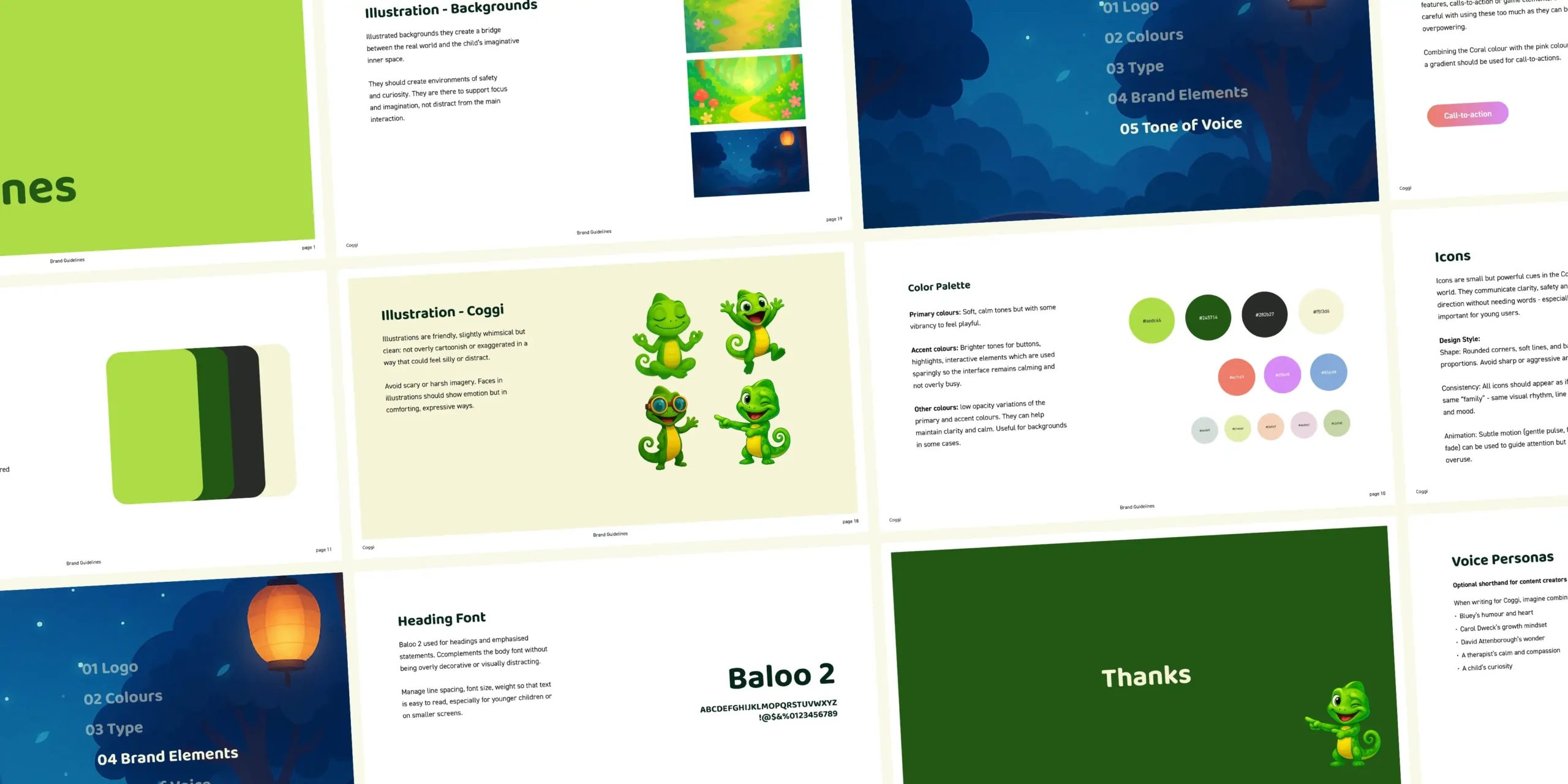
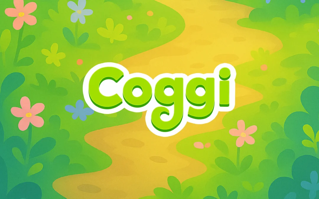
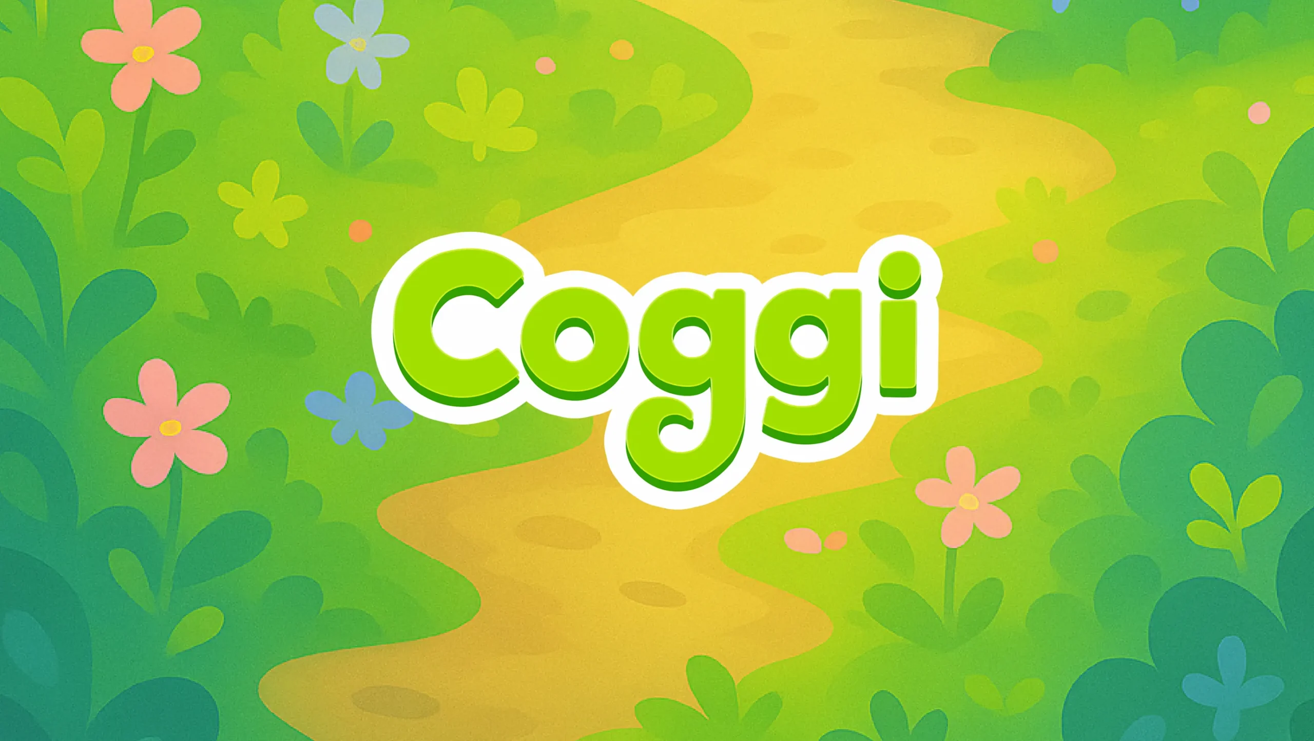
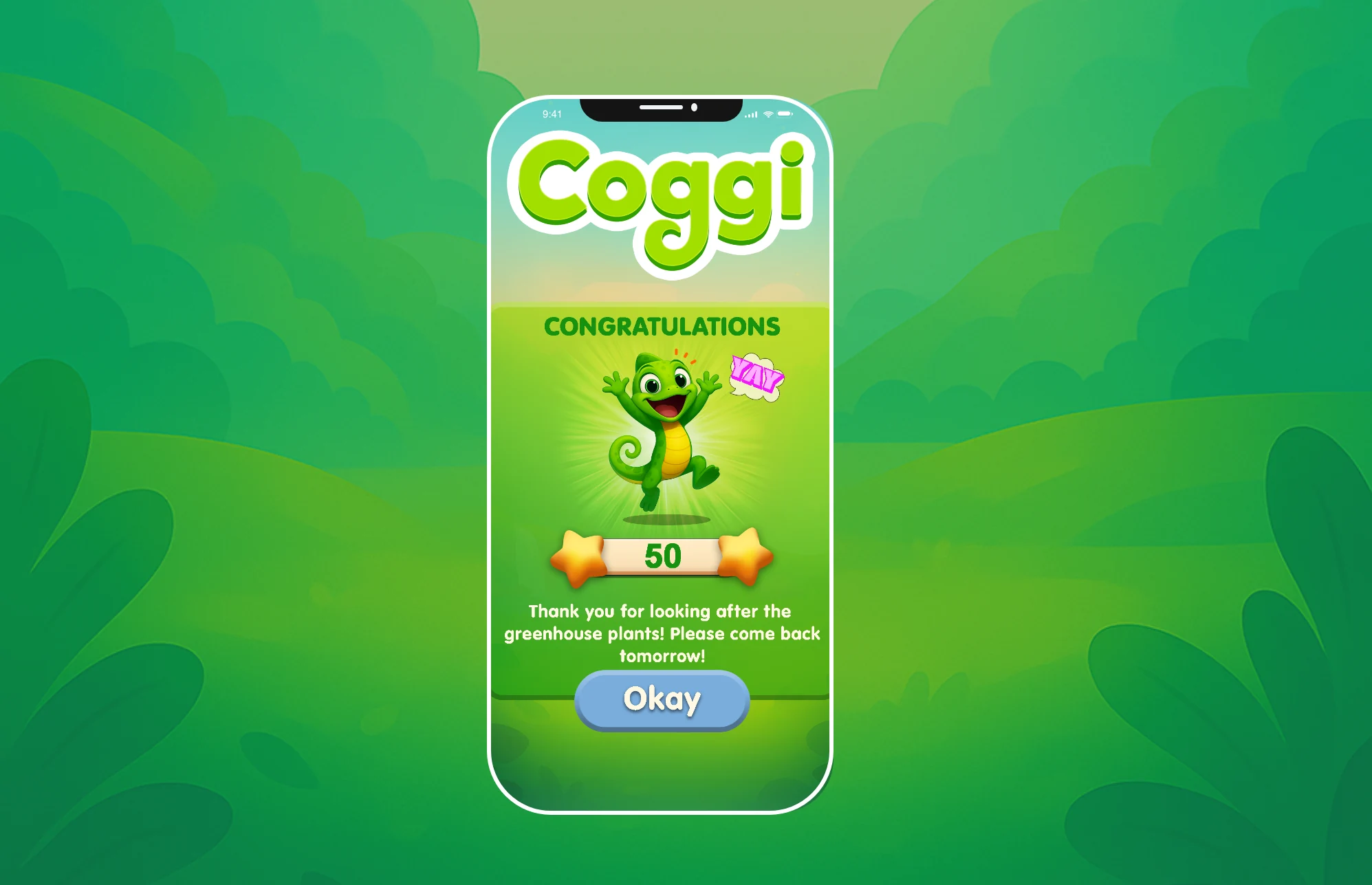
The idea we anchored everything to was simple: Coggi, the better screen time app for children. That gave us a clear goal for how the identity needed to make people feel. Cutting through a landscape that’s either loudly over-stimulating or stiffly “educational,” we crafted an identity that felt genuinely playful and alive to kids, while giving the secondary audience (the parents) instant reassurance that this was time well spent.
(03)
WEBSITE
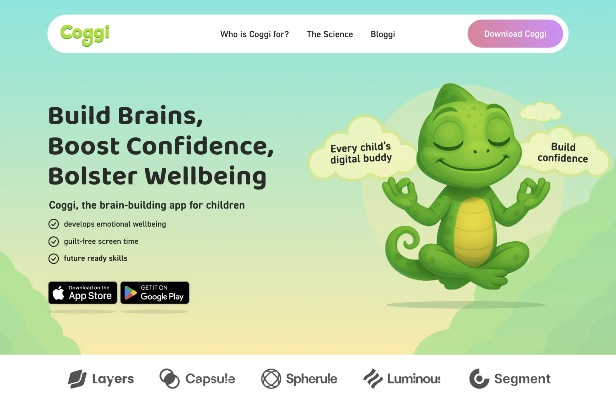
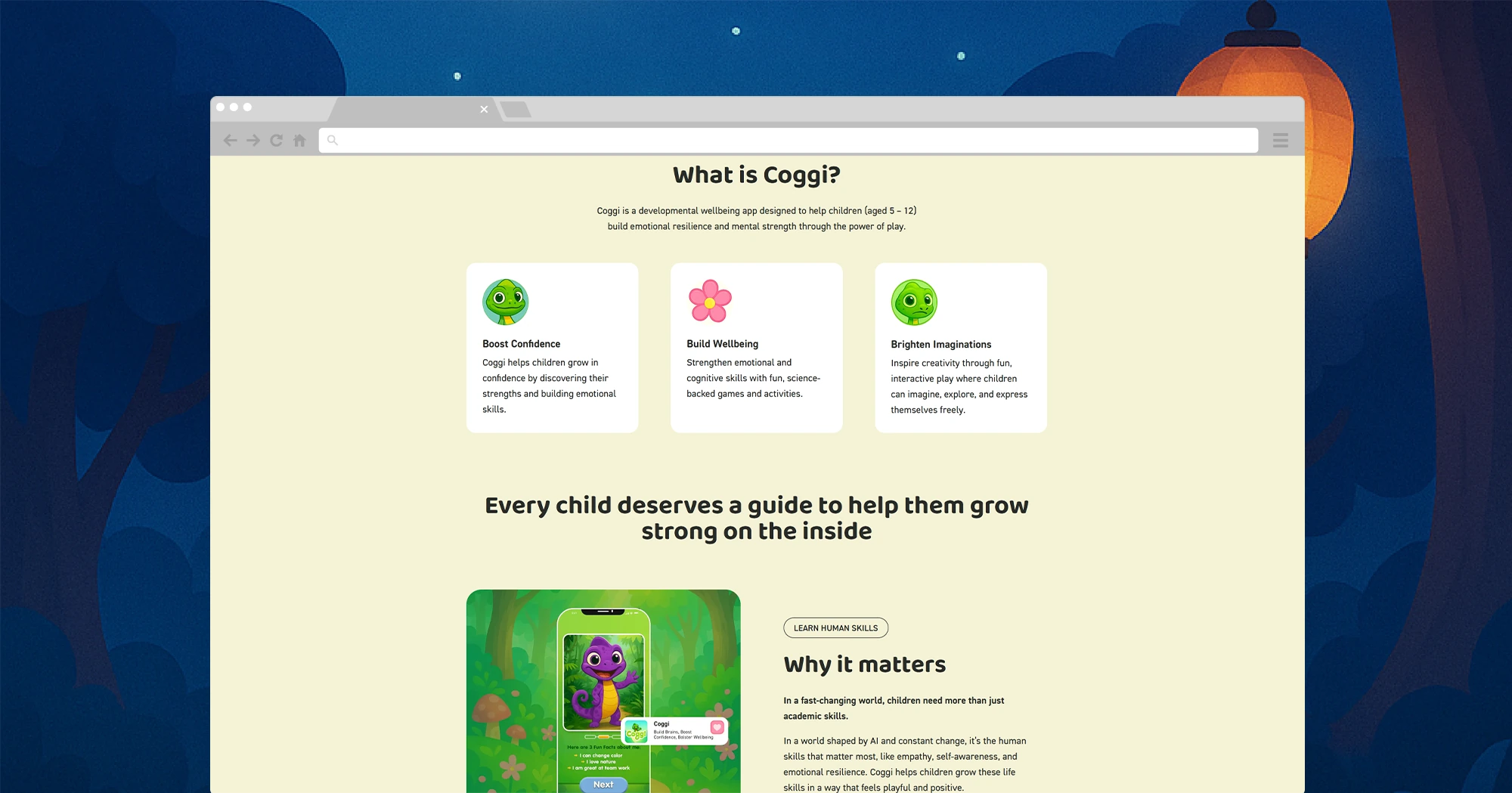
With the identity set, the site had to do two jobs at once. For parents – who are the ones actually reading it – it needed to build trust fast: clear positioning, real testimonials, and an obvious path to download or get involved. For kids, it needed to carry the playful, alive feeling of the brand so Coggi never read as just another worthy-but-dull wellbeing tool. We built it, leading with the “better screen time” promise, letting parent voices carry the credibility, and using the visual language to keep it warm and fun rather than clinical.